I went to work and updated some of the favorites:
It looks like we are in the lately annual "middle" spike for March.
This is the chart the comes with the Case Shiller Data. The three peak pattern seems consistent with previous times.

Notice that the real yield is still less than interest rates in the chart above. Also notice how historically low the div yield is.

VIX zoomed in, broke the 500 day, broke my resistance line, sitting on upper bollinger band (usually bullish for markets in the short-term, but I have a feeling it will only be a few days of "relief" once the debt deal passes.
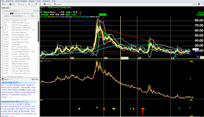
Long term VIX shows the resistance of the 500 day EMA for the past three years.
This is newly tracked. 50 EMA over 200 EMA constitutes hold long in the long term. Still amazingly high.Medium term in negative territory now.
Short term oversold. This could be the relief bounce for a few days.
Buying climaxes getting high again.
I'm working on the monetary base / CPI data for my own information. The nowandfutures.com chart works well too, but hides inflection points.
"The ultimate result of shielding men from the effects of folly is to fill the world with fools."
Herbert Spencer


No comments:
Post a Comment